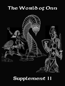
Just for kicks while I wait for a finished cover, I did a mock-up of some combined art from the old Onn Supplement I cover, bordered it with my red/blue and added in some of Kimberly's additional art. I have to say it looks like a good idea keeping the art inverted with a white/black motiff instead of the standard color or black/white. It makes the border pop too, something to catch the eye with.
We're on the artist's time table now, so as soon as that's done, the book will go on sale.
Thursday, February 11, 2010
Subscribe to:
Post Comments (Atom)


No comments:
Post a Comment